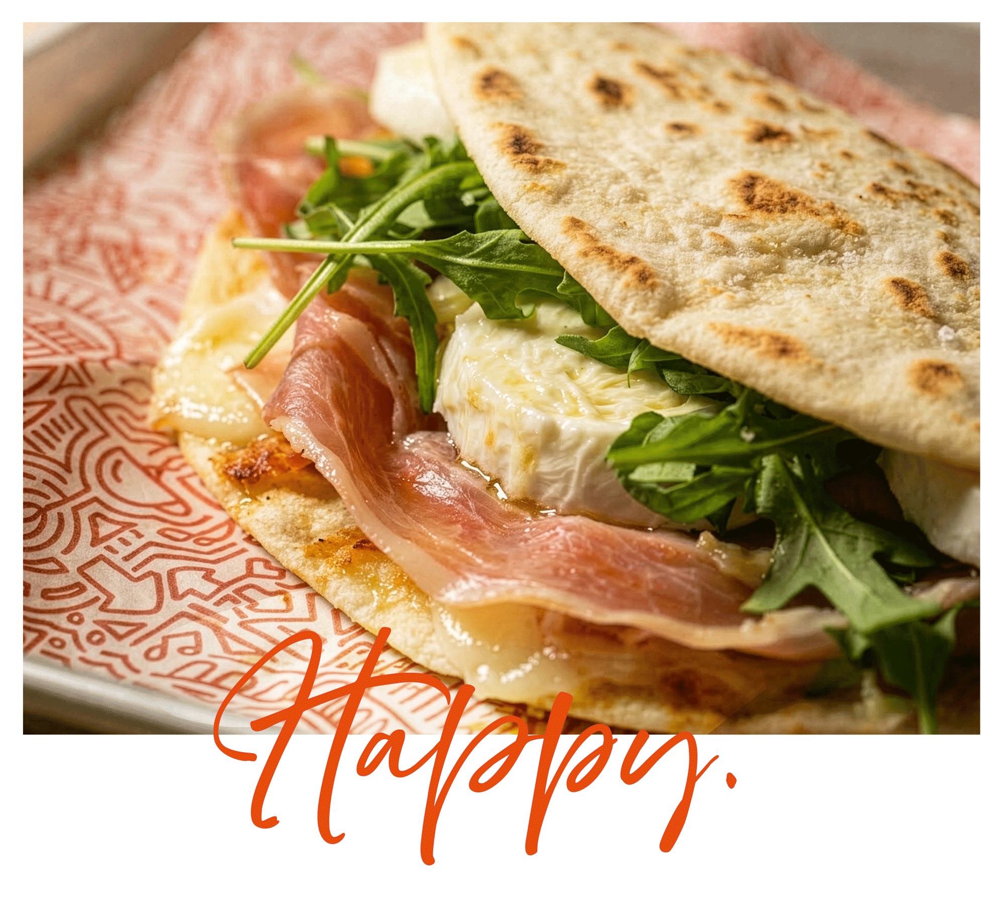
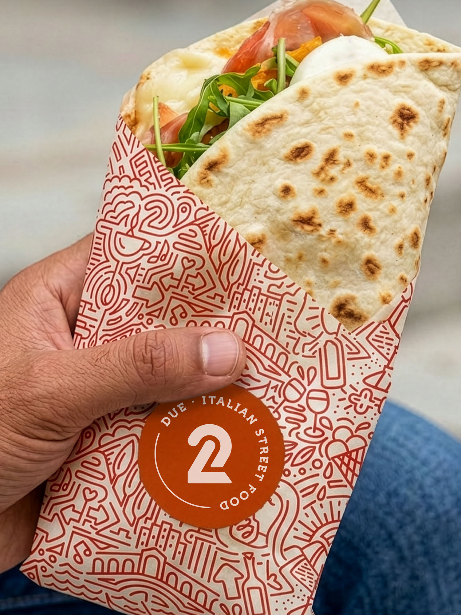
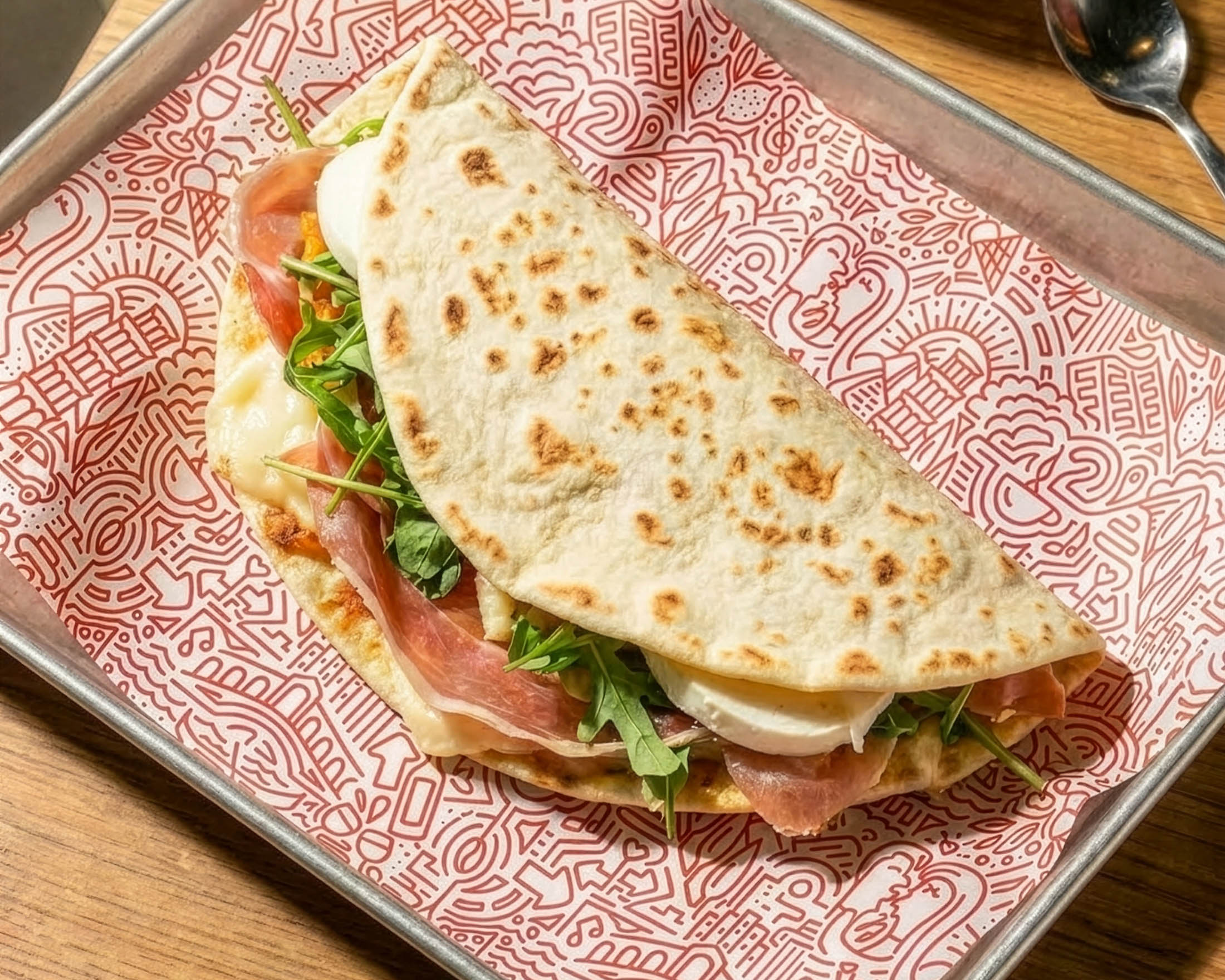
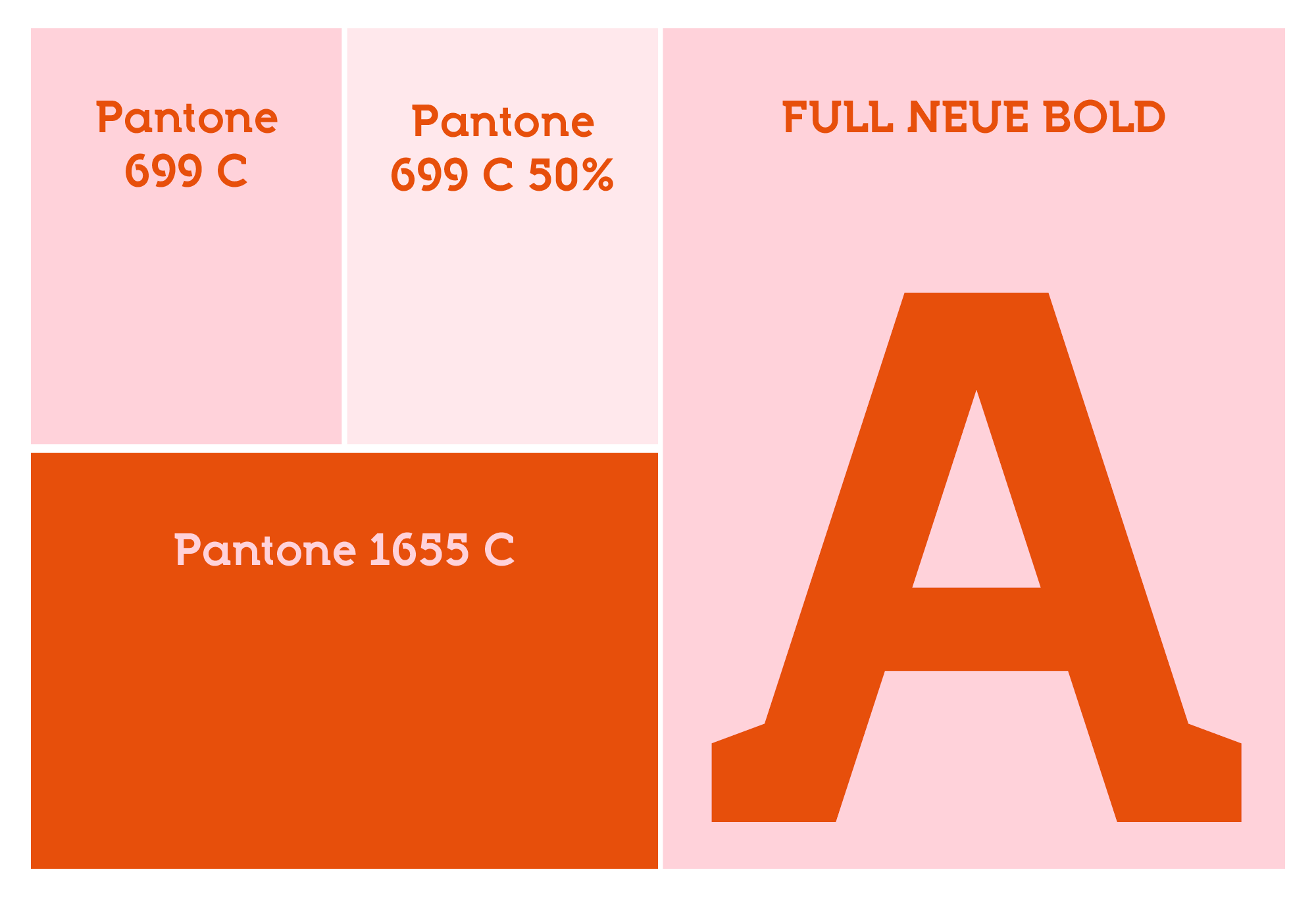
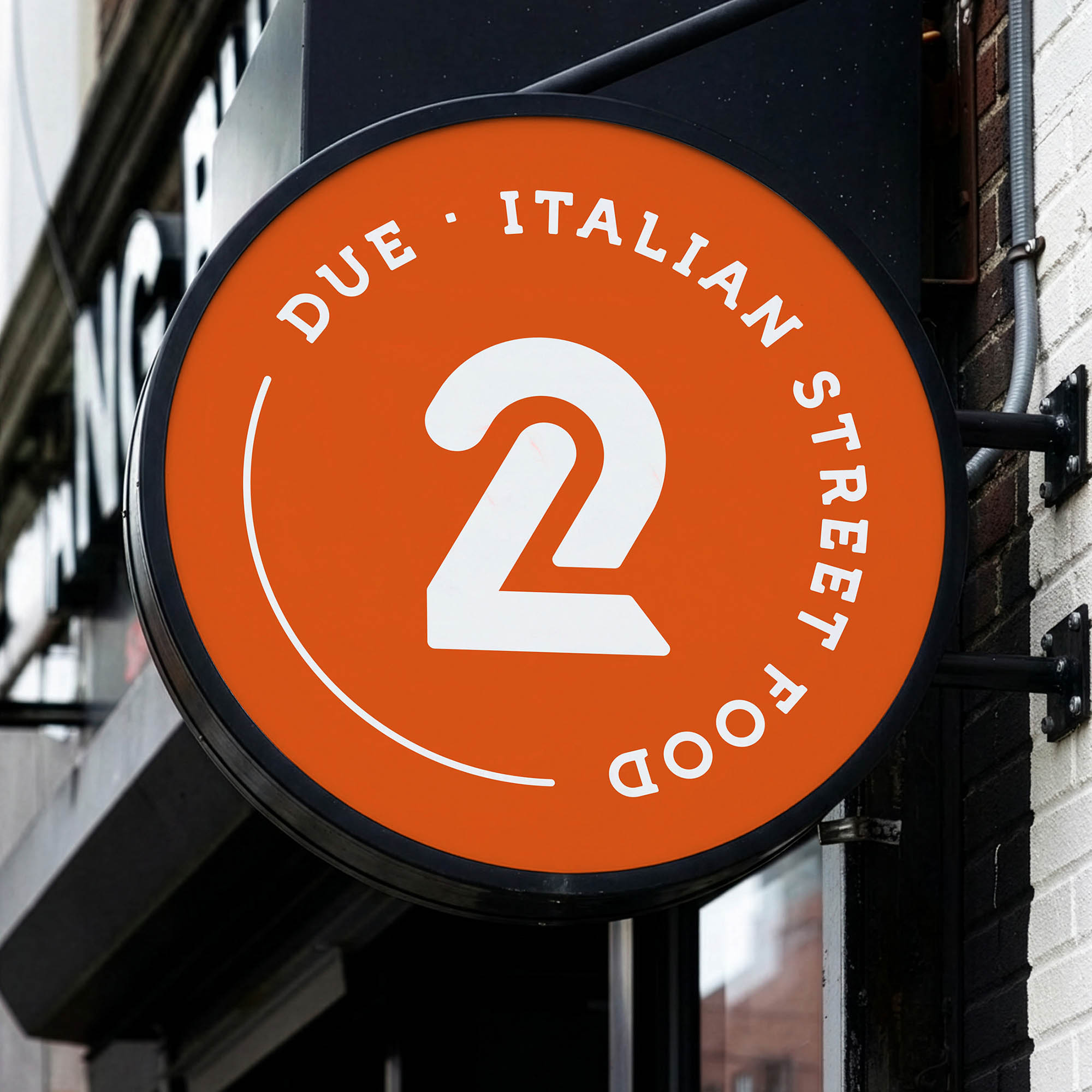
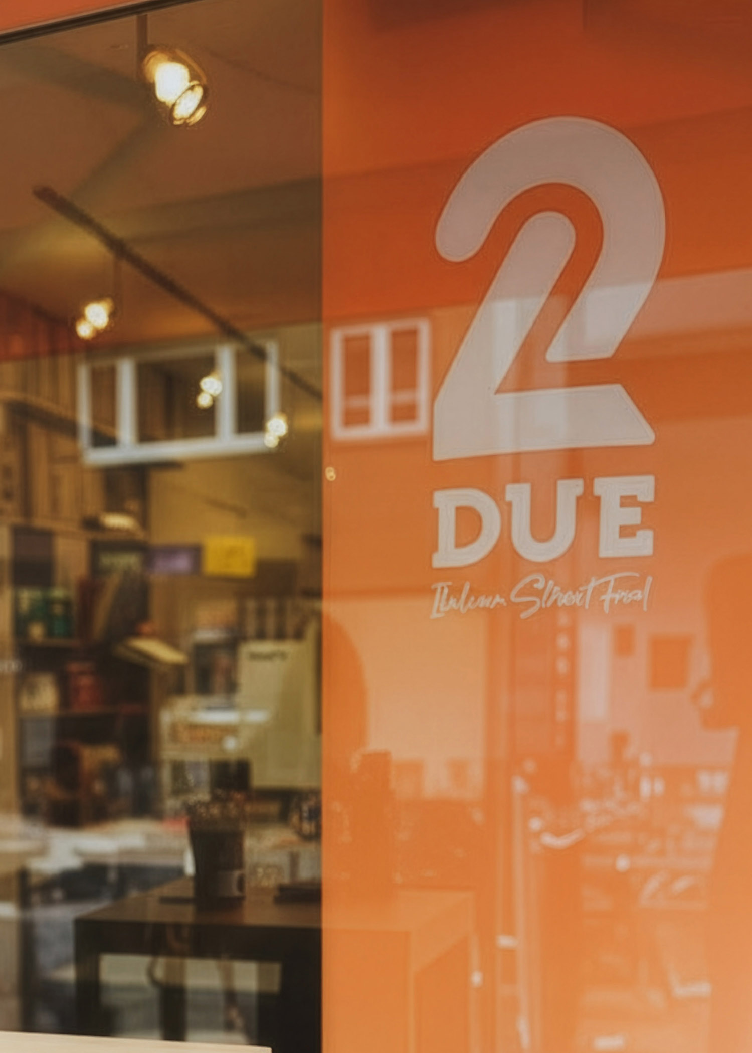
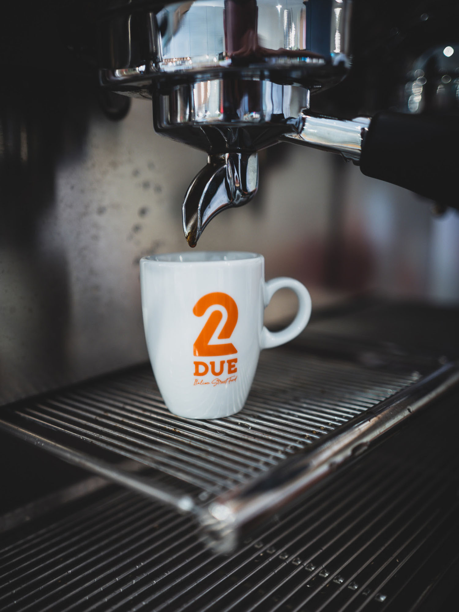
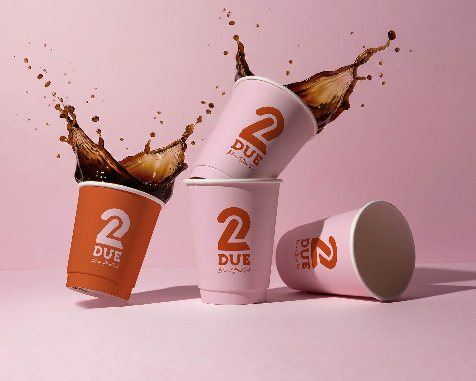
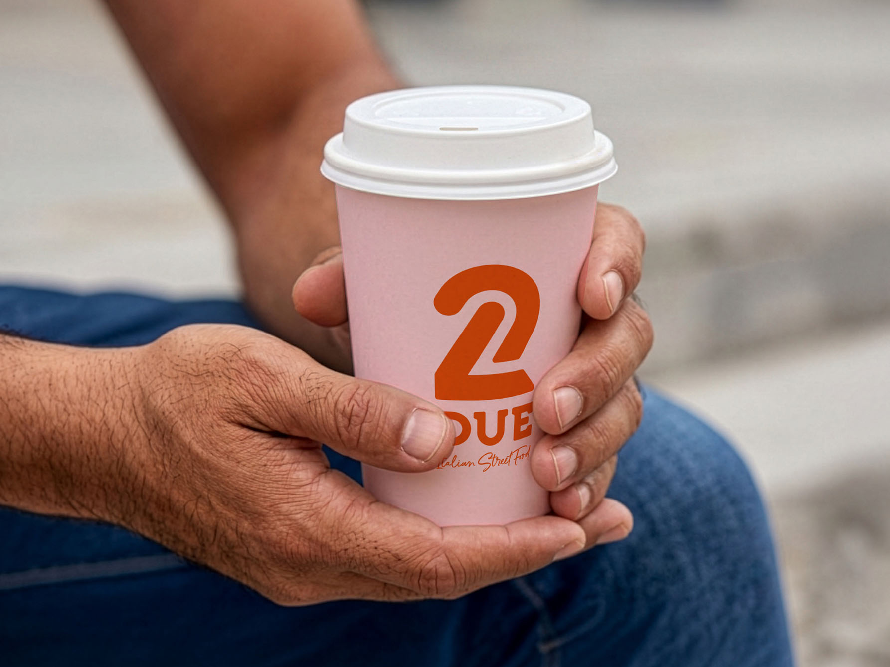
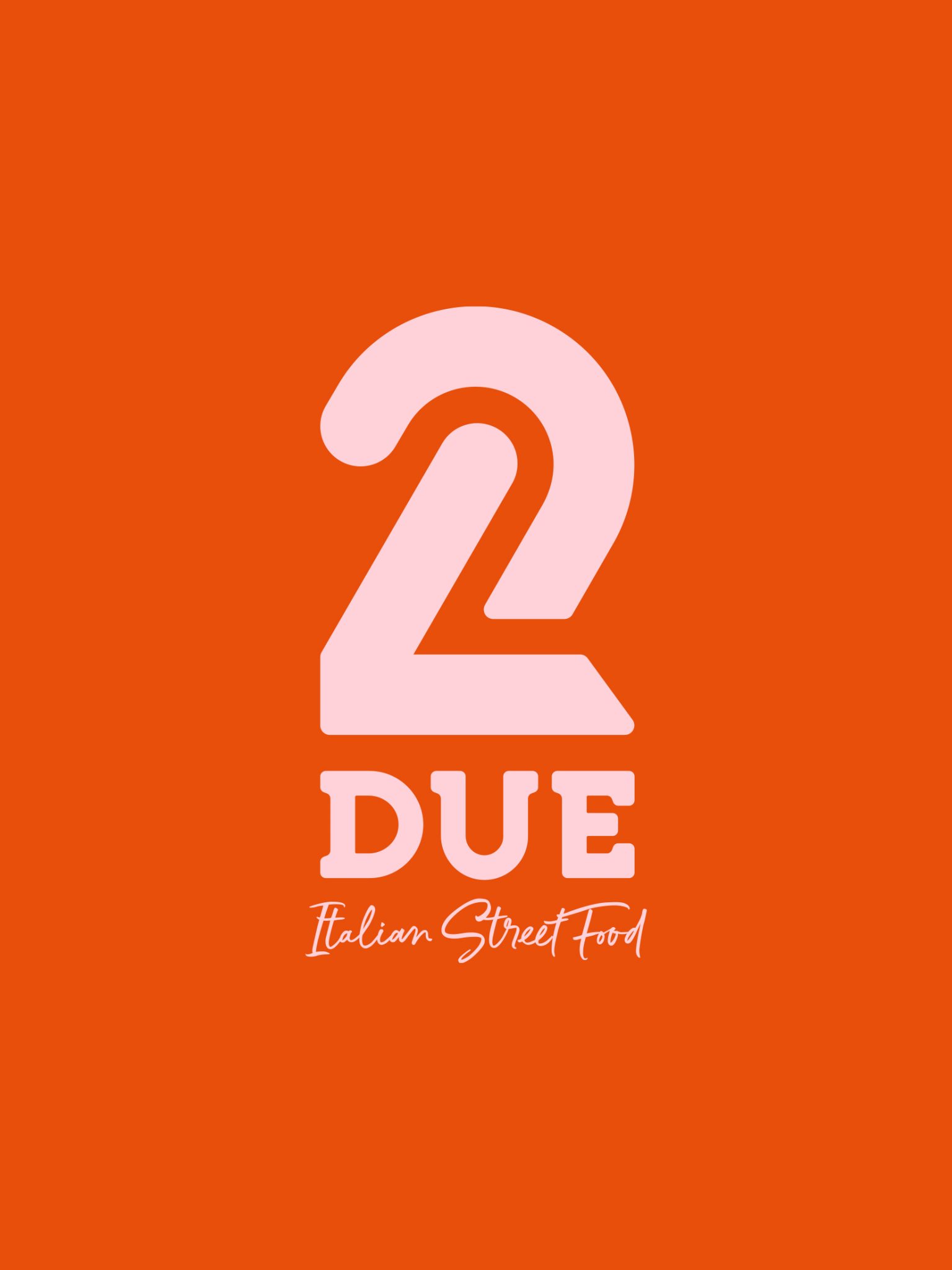
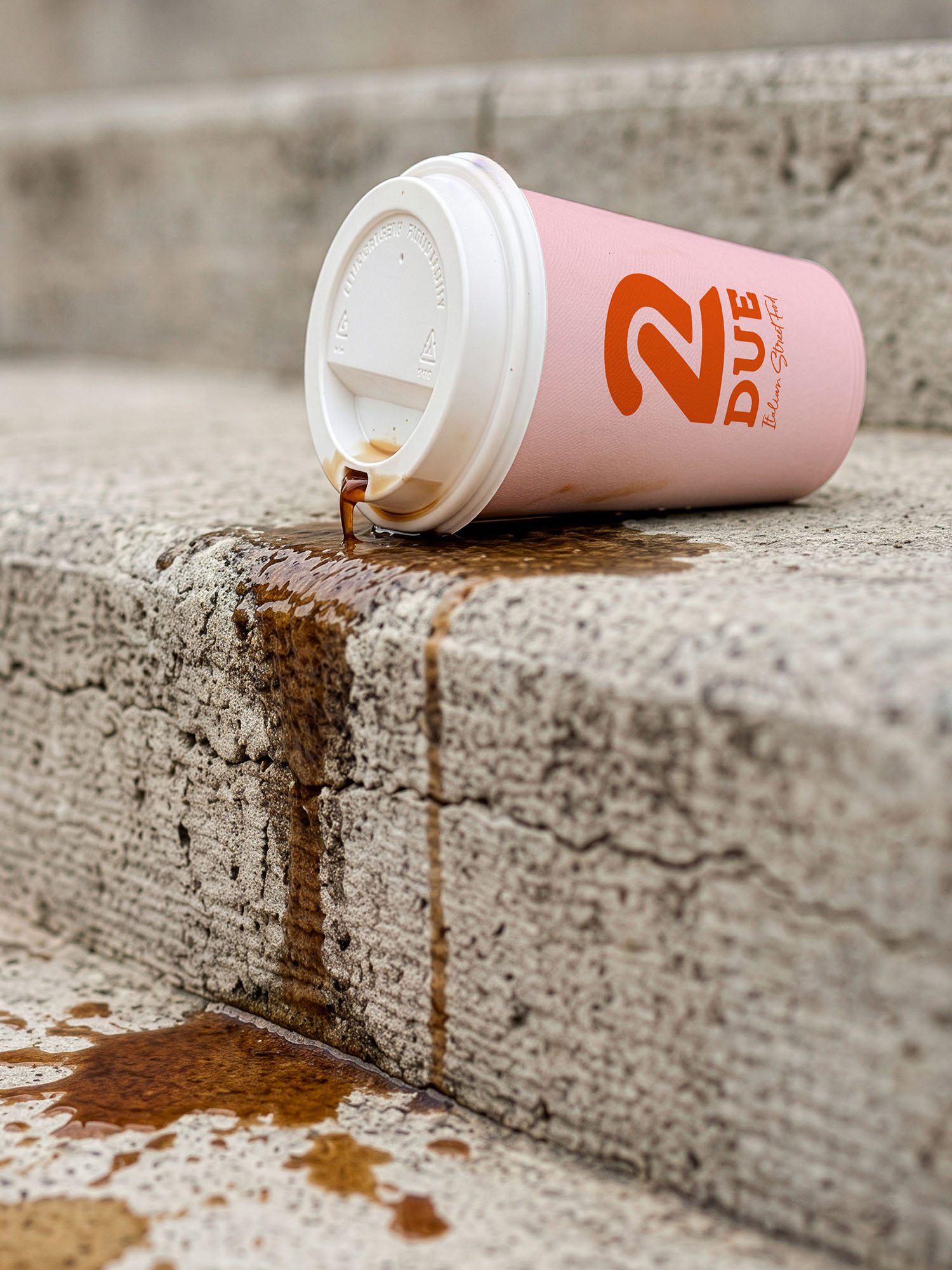
DUE is an Italian street food concept centered around piadina — the folded flatbread specialty from Northern Italy, often described as the region’s original street pizza. The identity is built around the meaning of the name itself: due, Italian for two. This idea of duality becomes the foundation of the visual system, distilled into a bold symbol constructed from two expressive strokes forming the number 2.
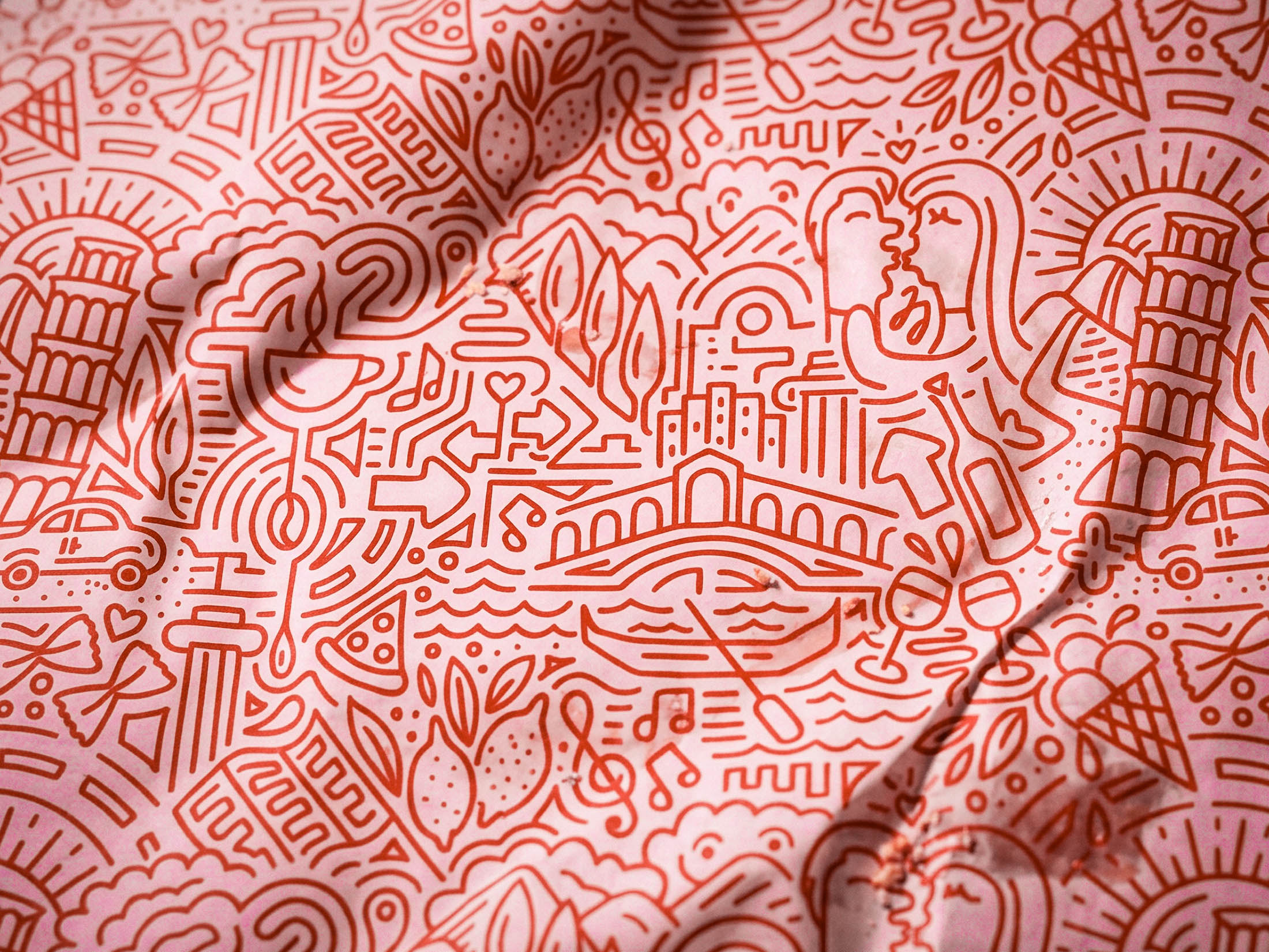
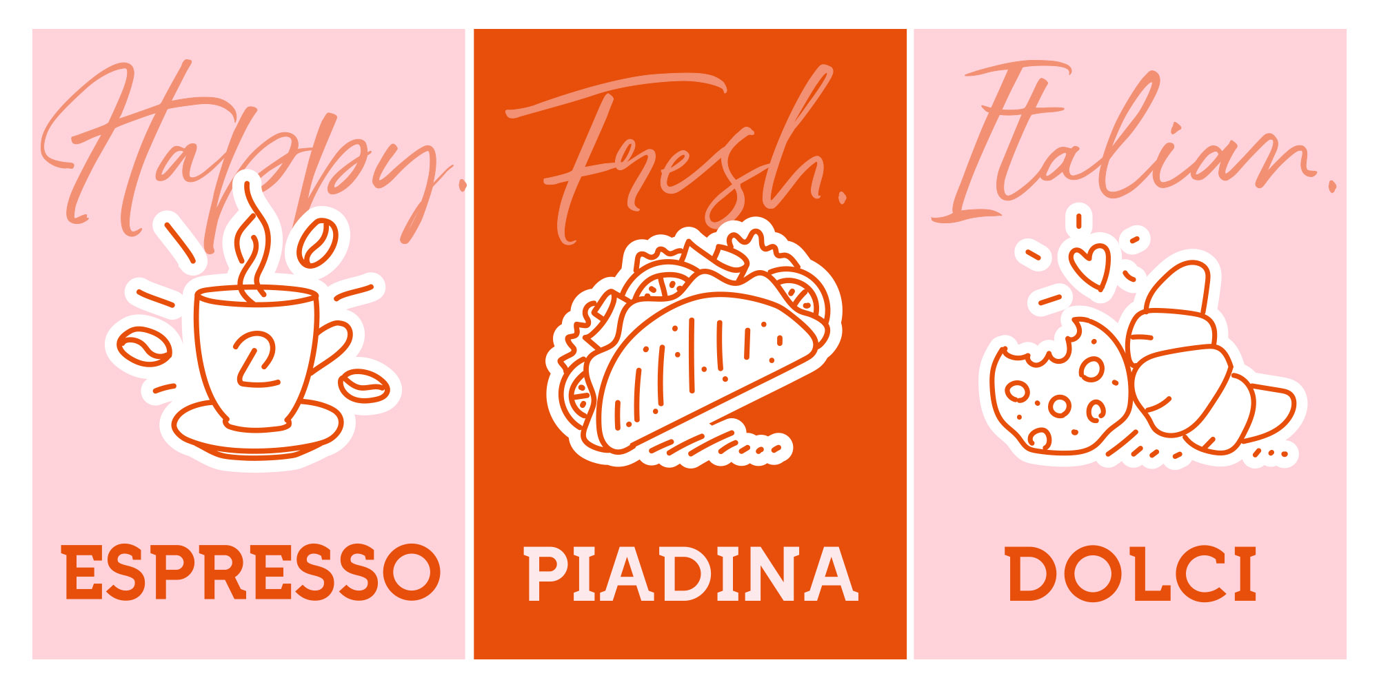
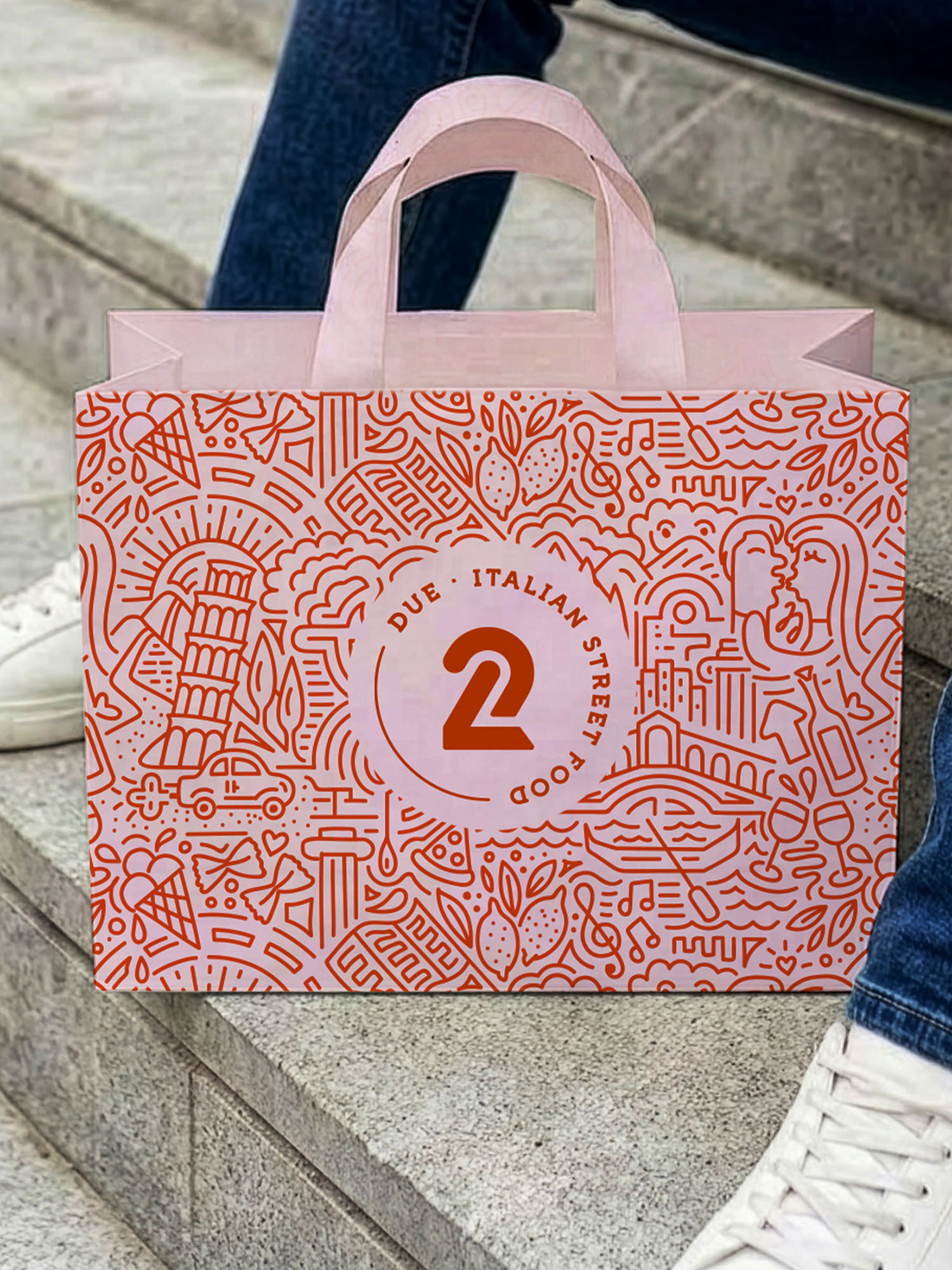
The identity combines a minimal logomark with an expansive illustrated pattern capturing fragments of Italian everyday life — espresso, gelato, cypresses, wine, architecture, and street scenes. The illustrations intertwine into a dense, rhythmic composition that flows across packaging, wrapping paper, menus, and store collateral. Immersed in the pattern, customers are drawn directly into the atmosphere of the Italian dolce vita, evoking the warmth, spontaneity, and pleasure of Italian street culture.
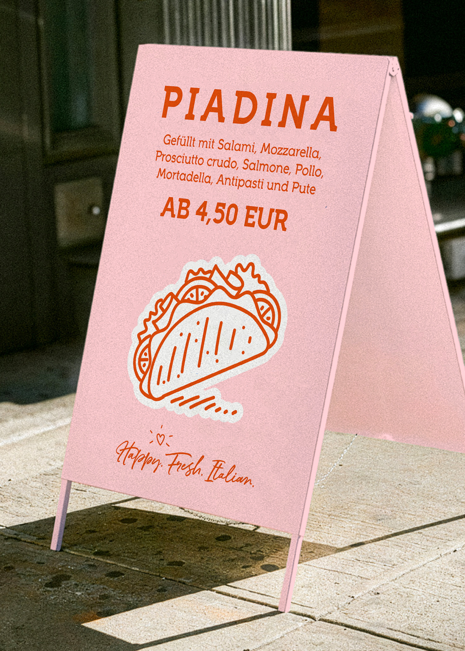
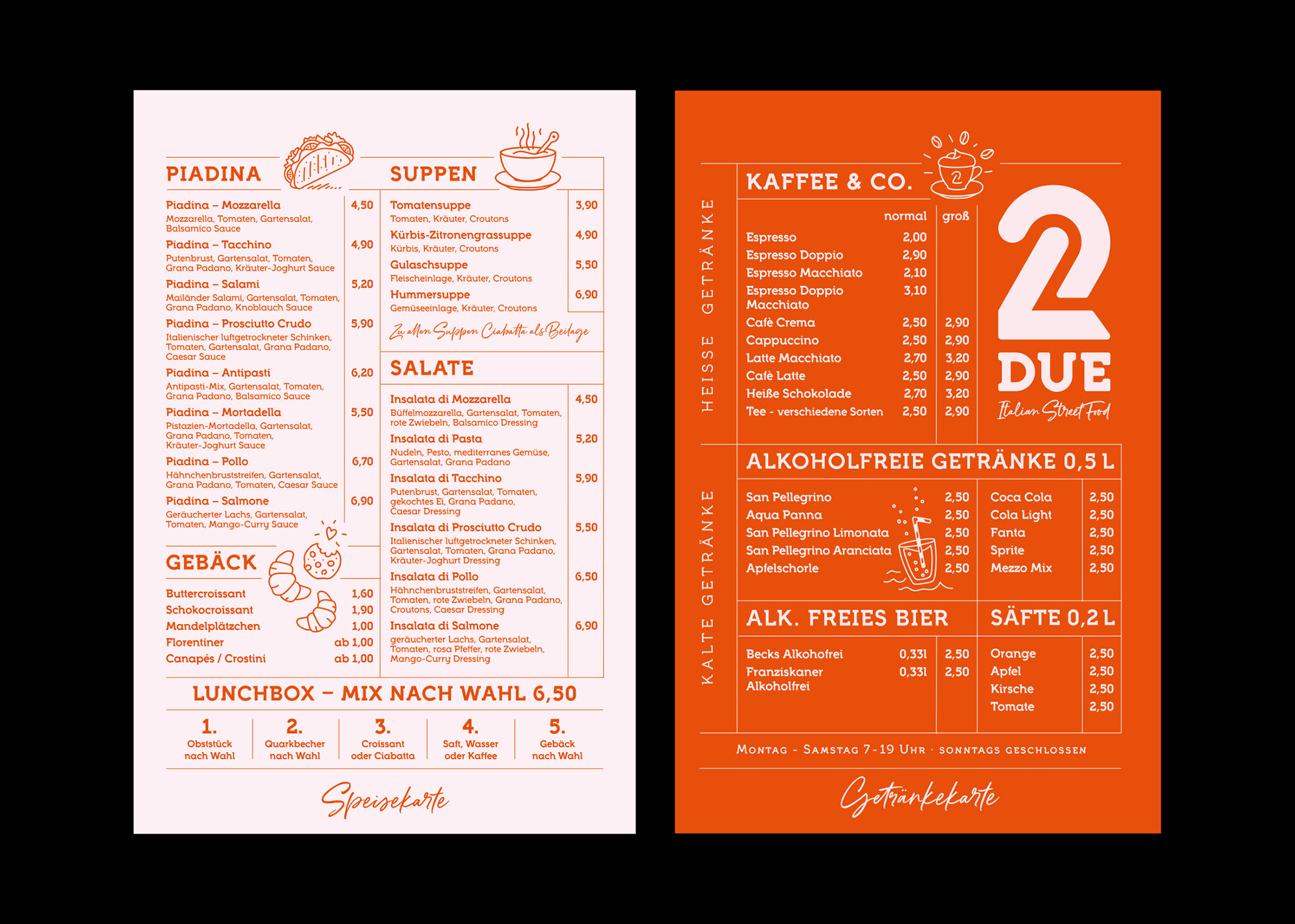
A palette of vivid orange and dusty pink gives the brand a playful yet refined character, while expressive typography and hand-drawn elements create a tactile and energetic visual language. Typography, illustration, and graphic forms interact like ingredients assembled in motion, shaping a layered identity full of rhythm, appetite, and Italian spirit. We approached to create a branding that reflects the brands elegant, timeless and artisan feel. Using a natural yet sophisticated color palette set against intricate logo details in gold foil, we created a variety of packaging elements that were playful and emphasize the brand`s extraordinary feel. Inspired by the brands rands name "Zana" which means graceful lily, we incorporated this flower as main element to the brand identity.