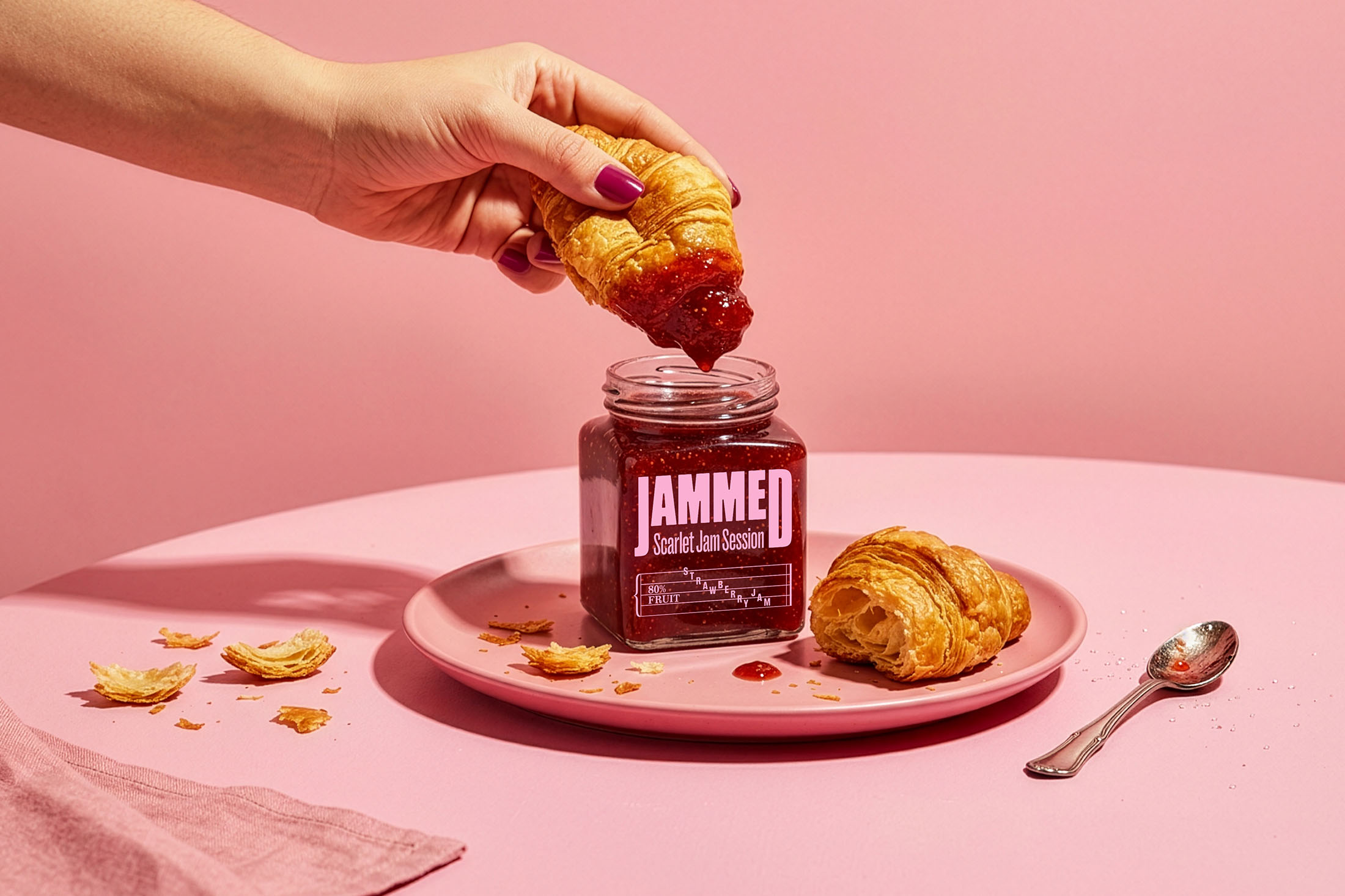
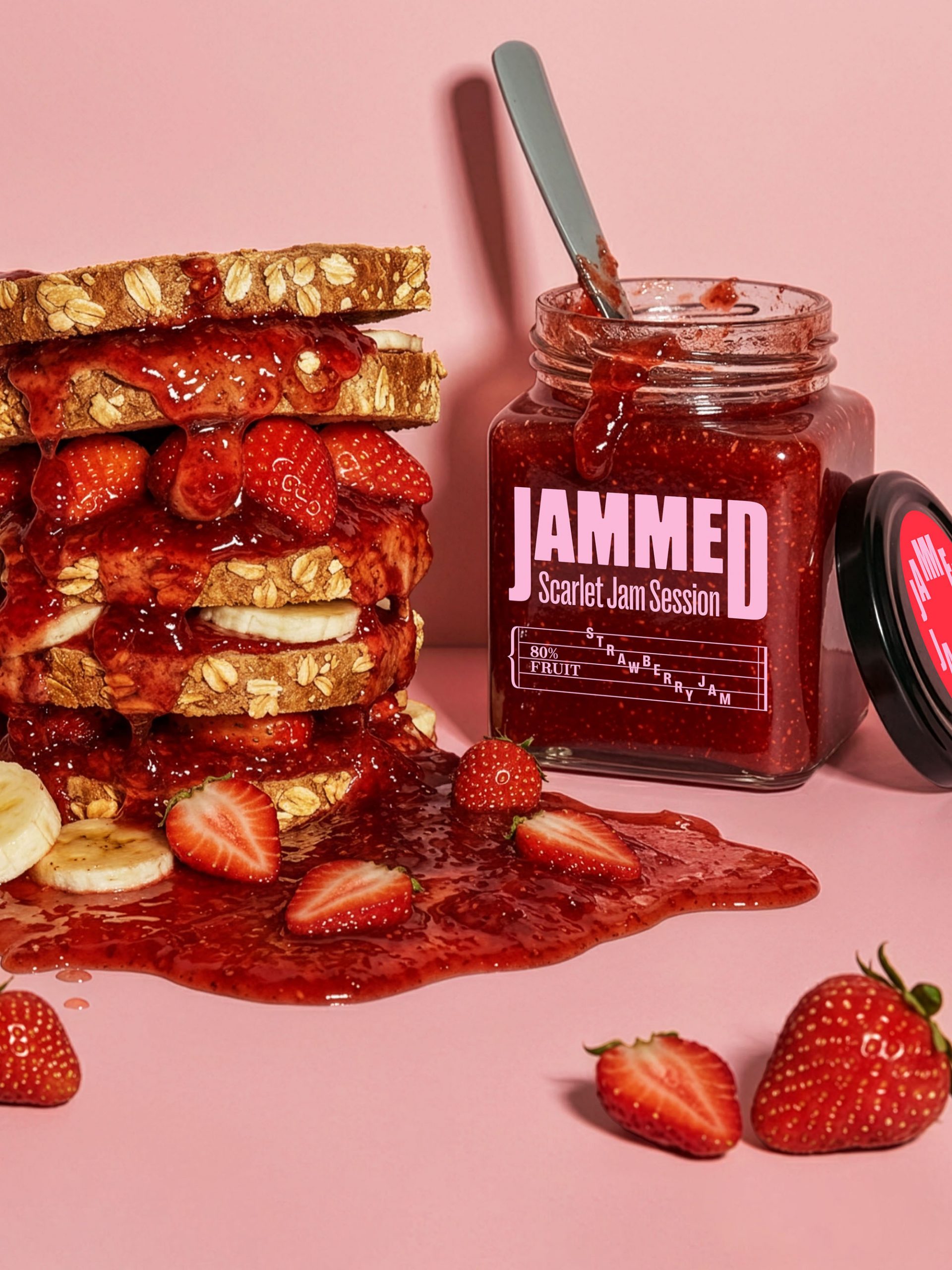
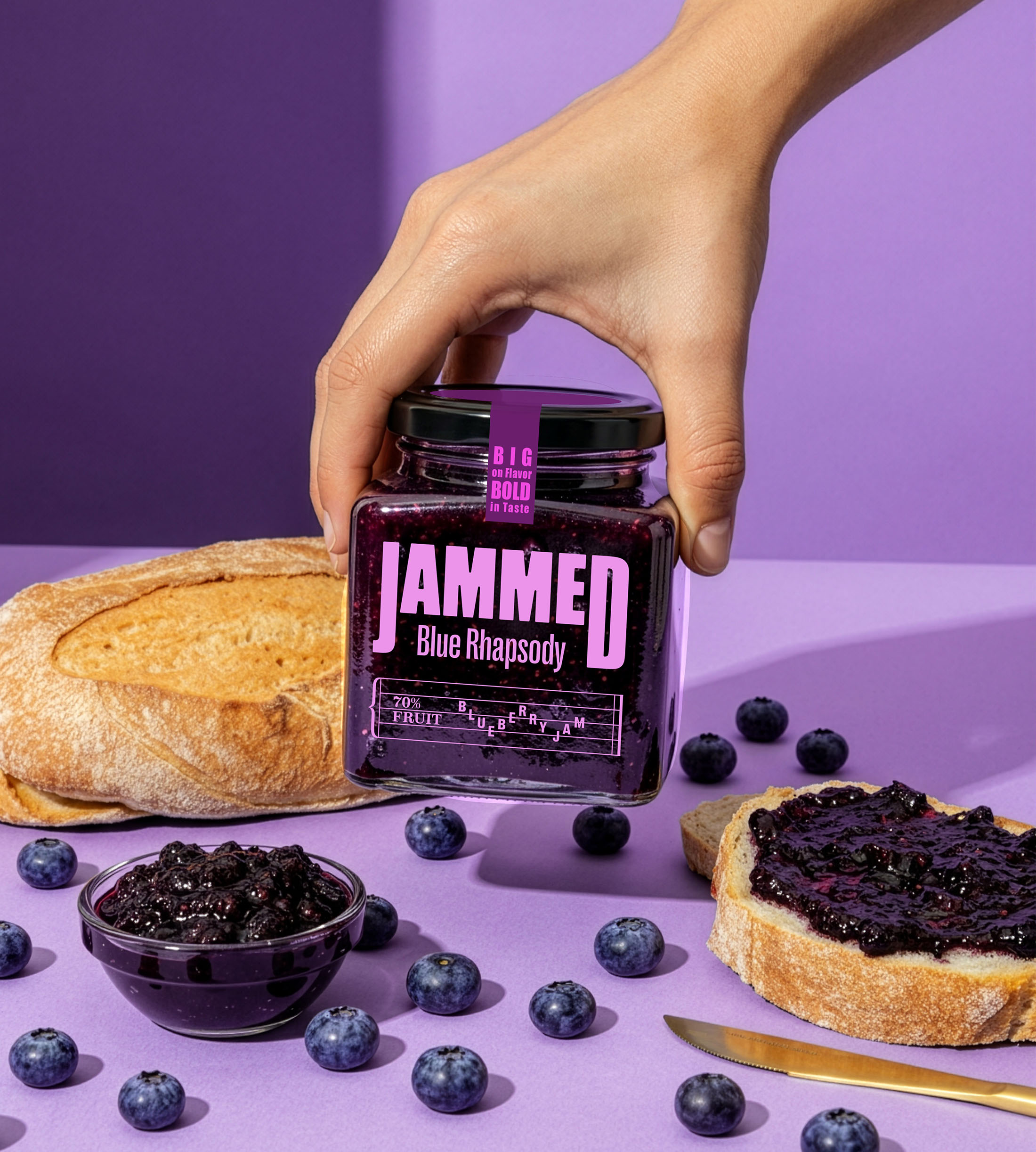
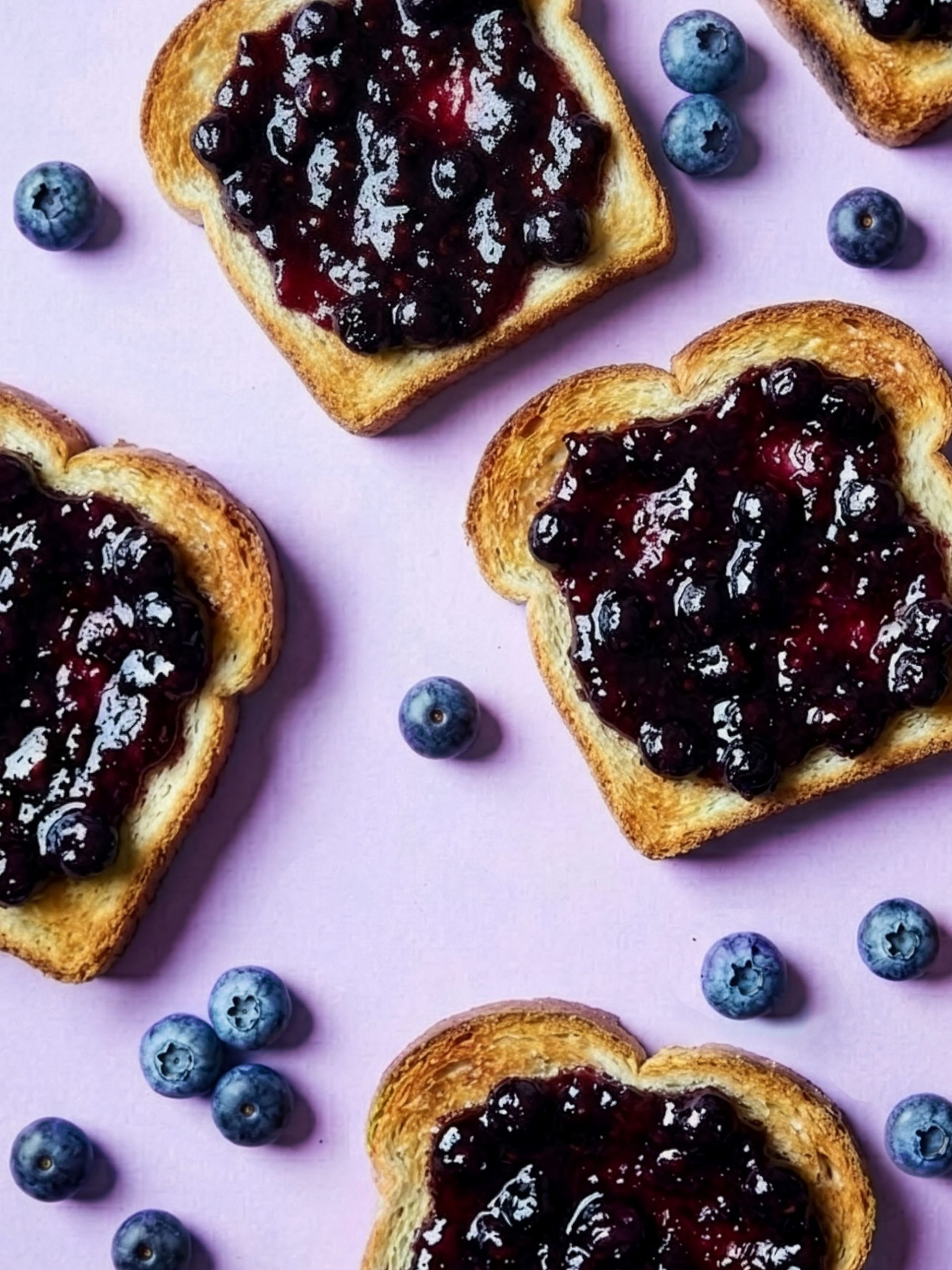
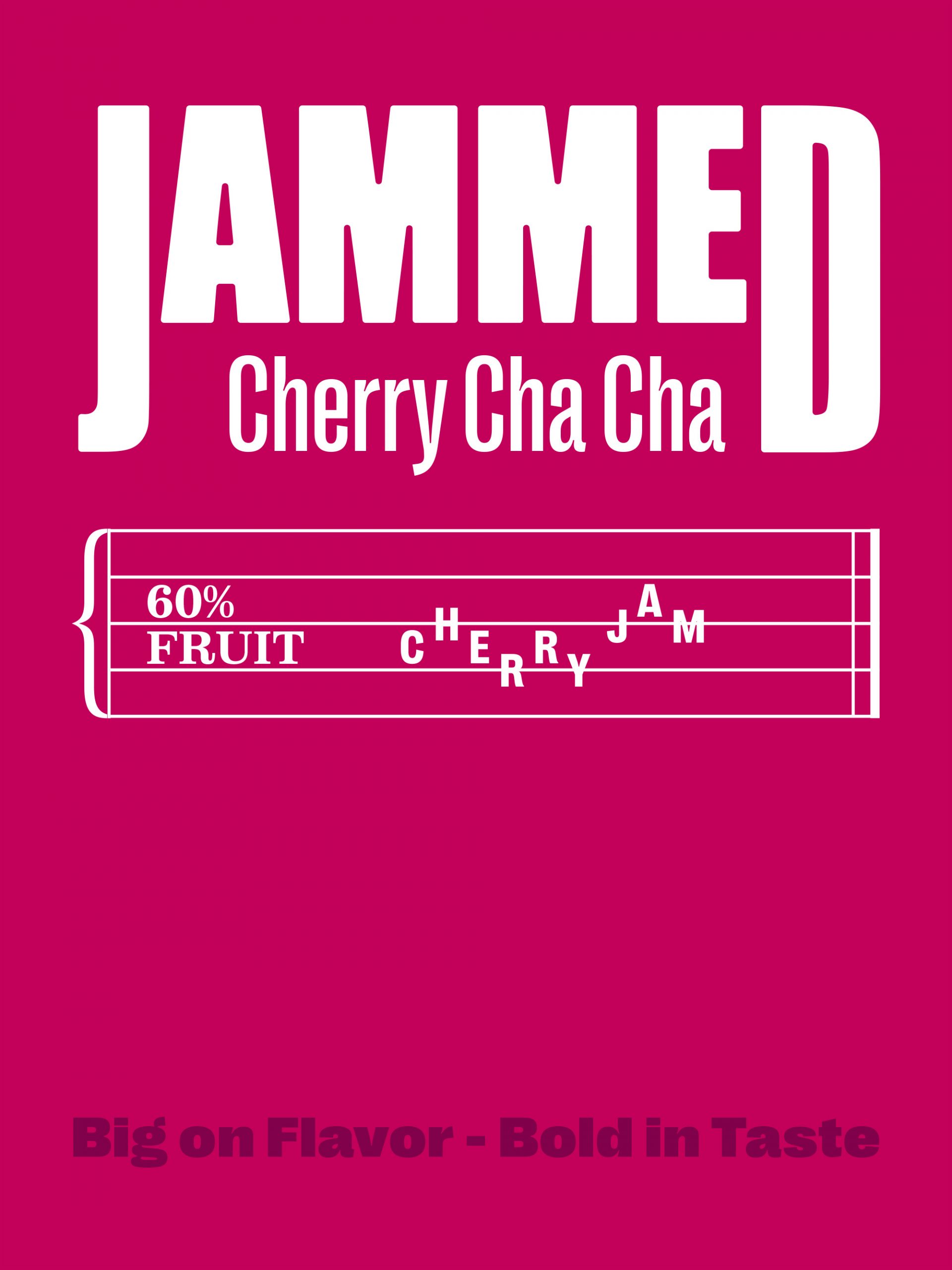
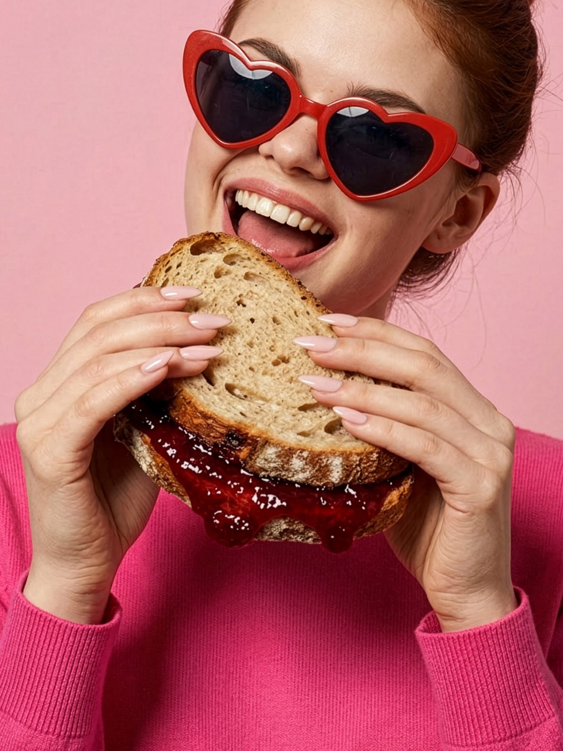
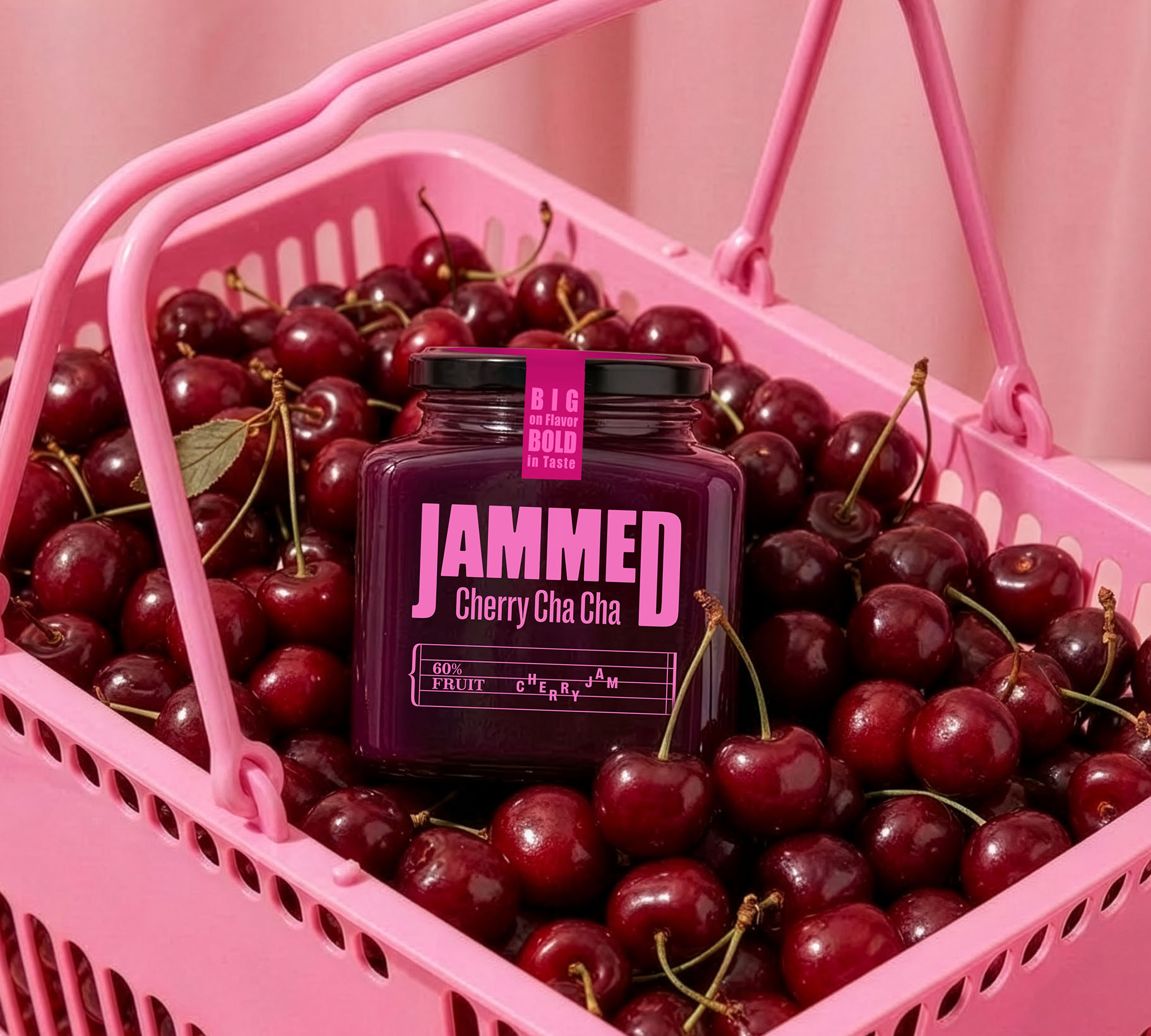
Inspired by the energy and spontaneity of a great jam session, Jammed transforms an everyday breakfast favourite into a brand full of rhythm, flavour and personality. Built around the playful connection between music and fruit preserves, the identity celebrates the simple joy of sharing good food, good music and good company.
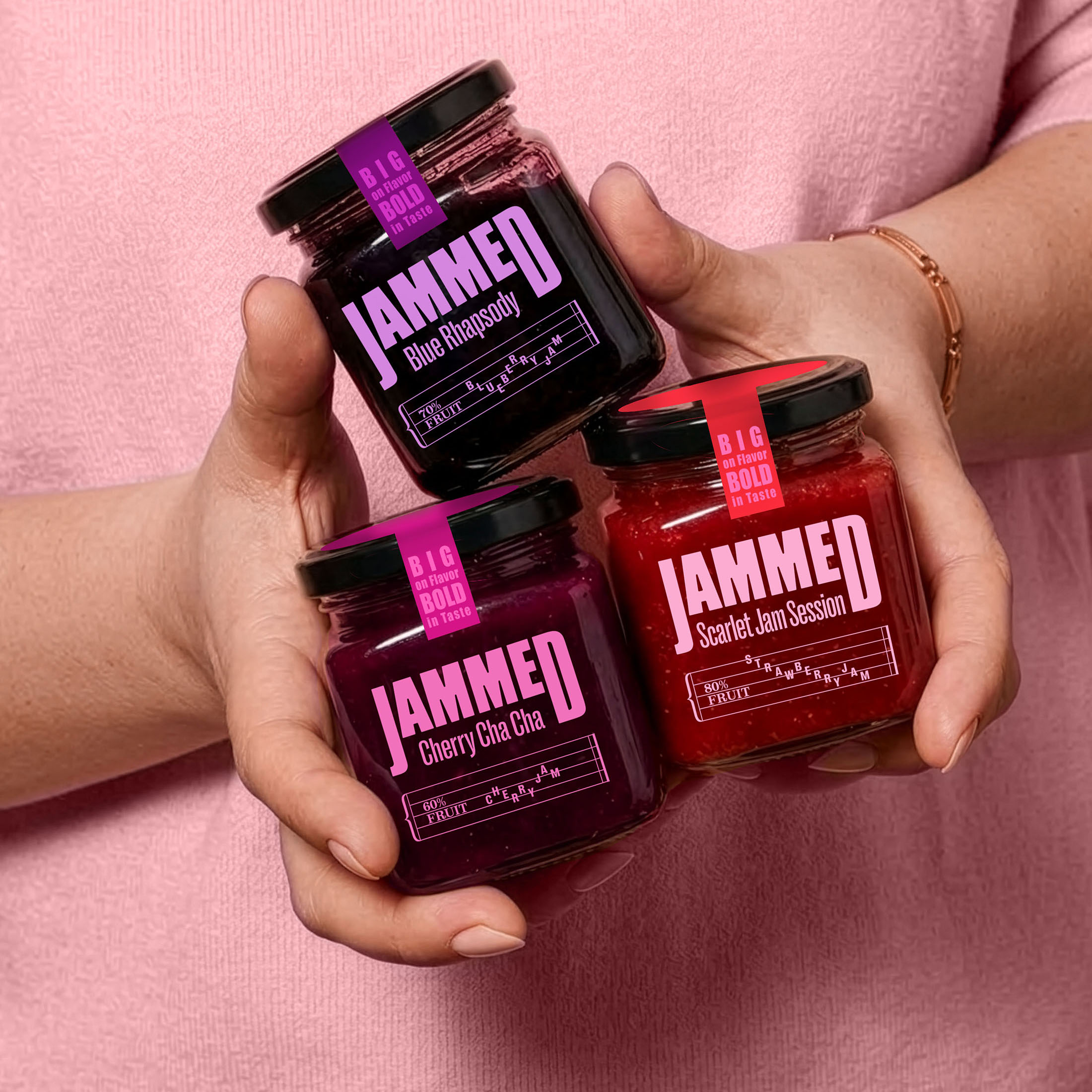
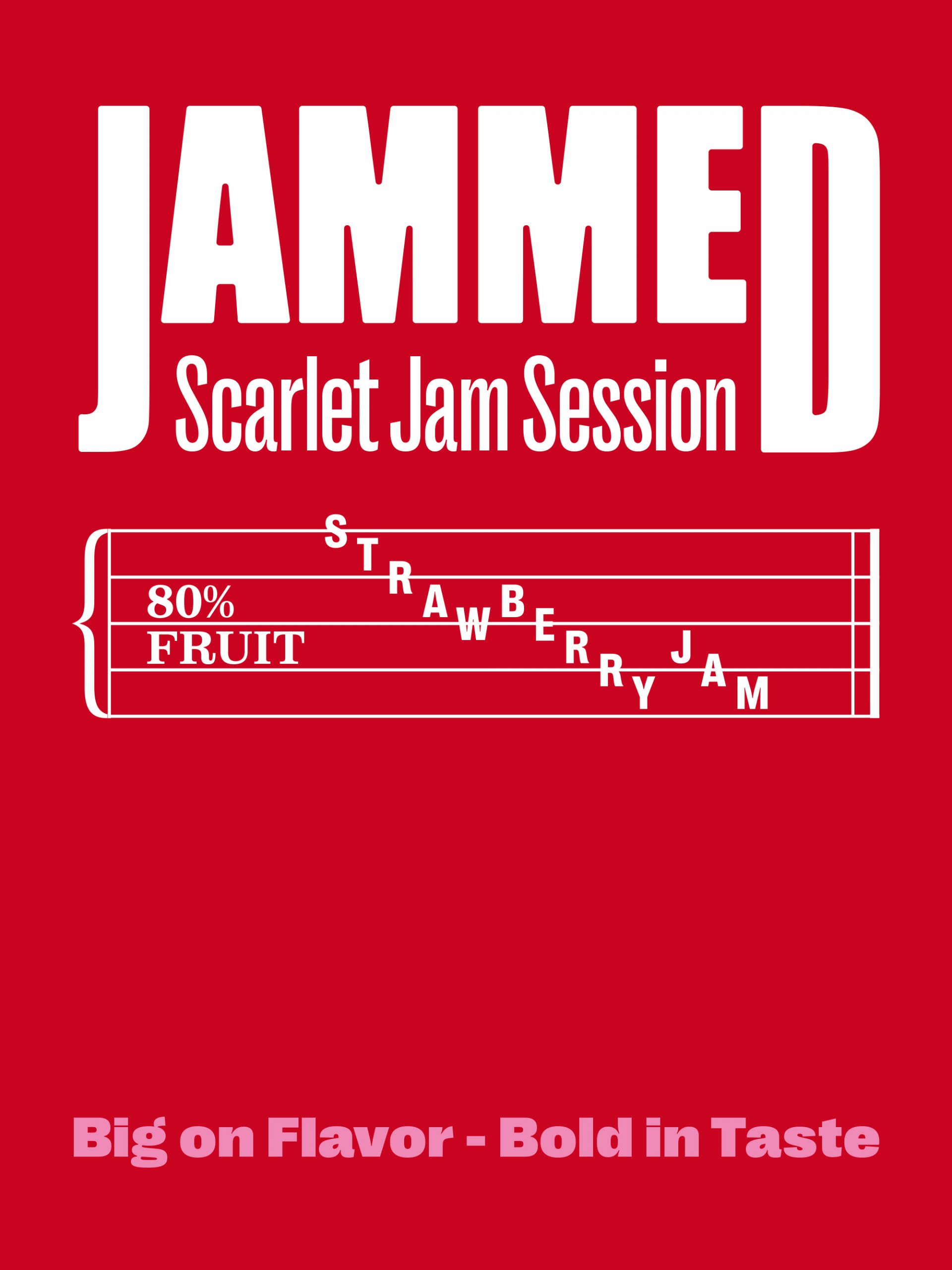
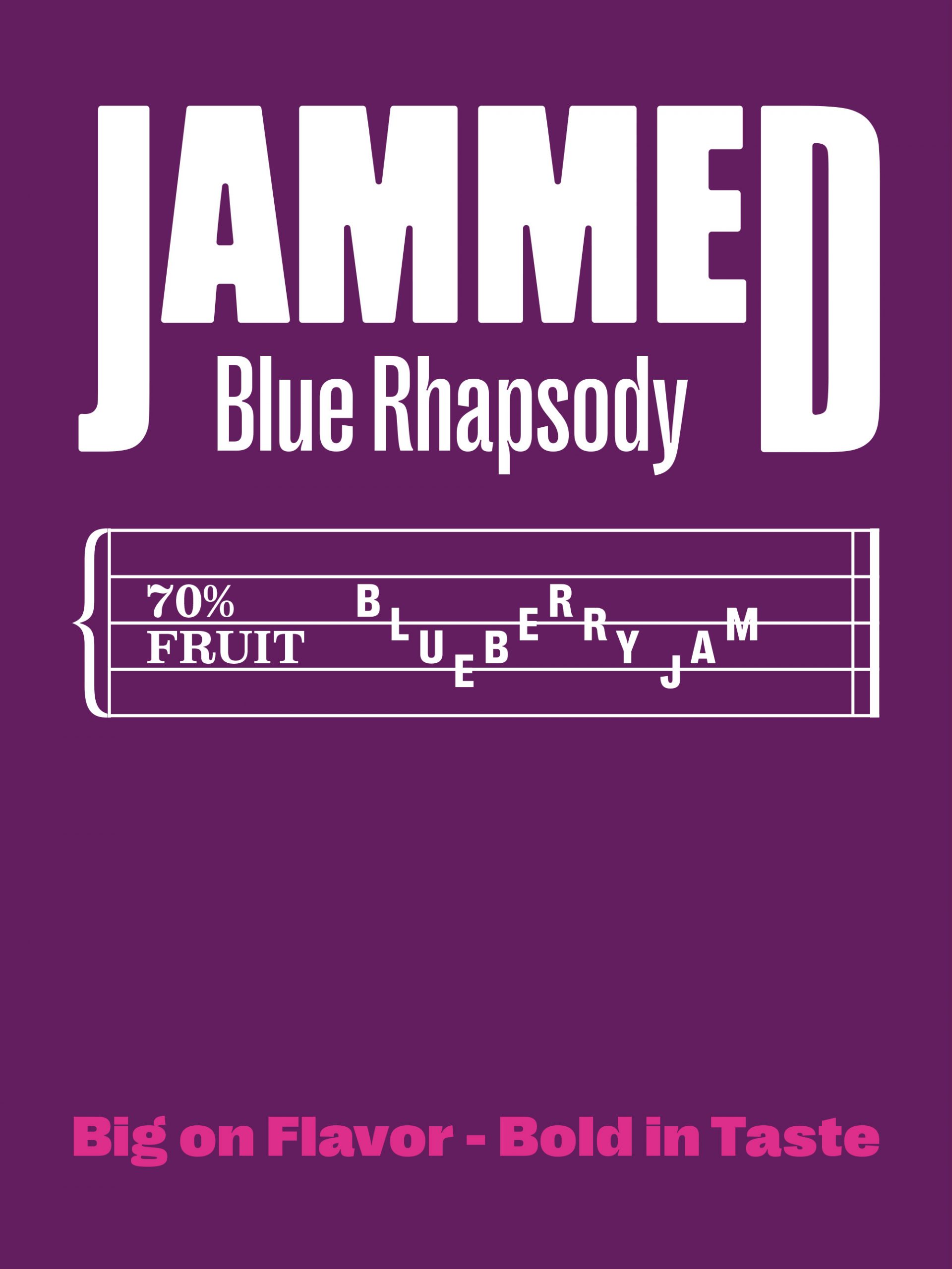
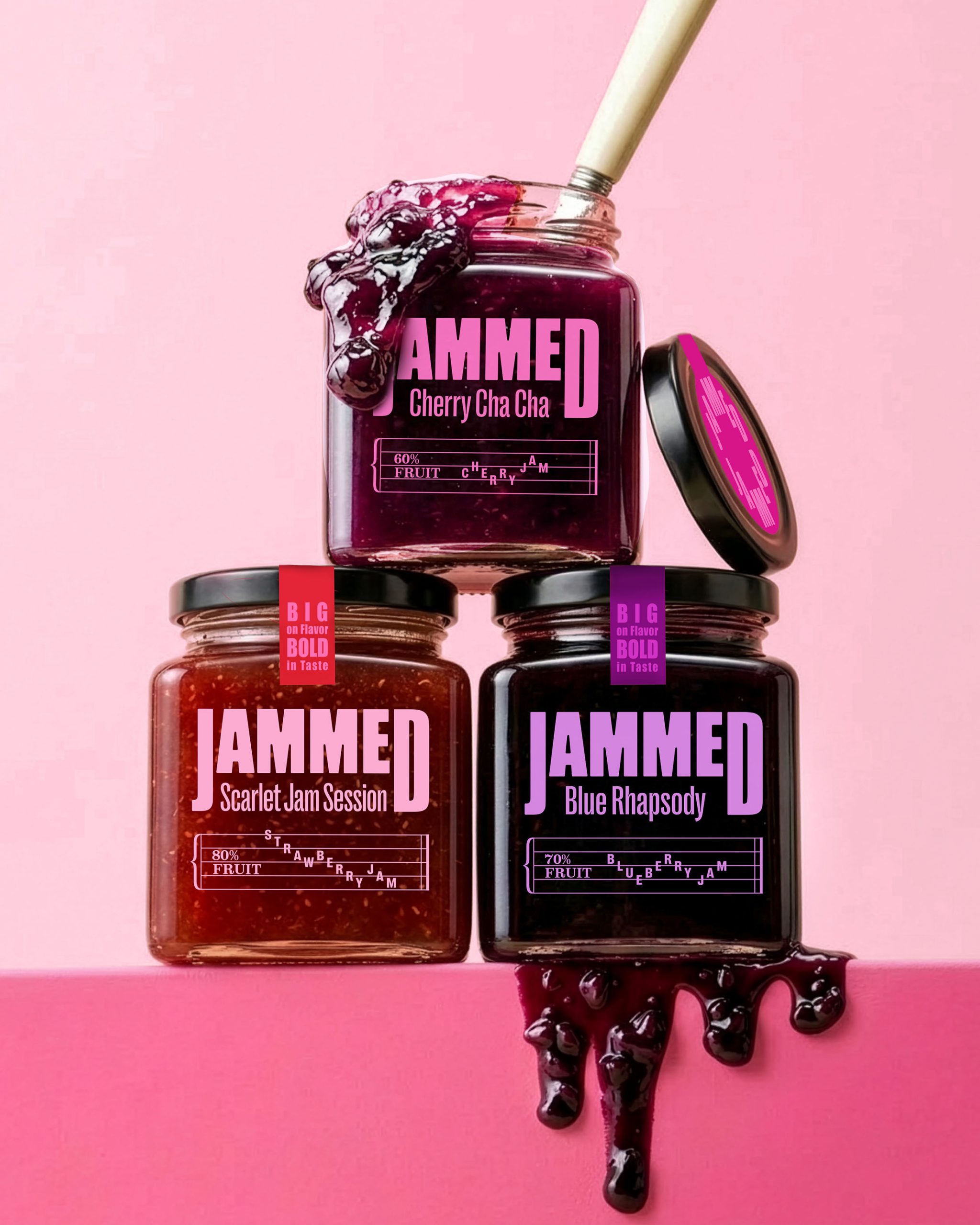
Musical notation becomes the brand's defining visual language, flowing across the packaging through expressive flavour names and tasting notes arranged like sheet music. Together with bold typography and vibrant colours, the identity captures the playful energy of a jam session while creating a distinctive shelf presence.
Bold in character yet minimal in execution, this jam packaging design system gives every flavour its own personality while remaining unmistakably part of the same vibrant brand family.